The Importance of Colour Theory in Furniture
Colour theory is both a science and an art, guiding the use of colour to create visually appealing and meaningful designs. It provides a framework of principles that designers follow to communicate effectively with consumers through well-balanced colour schemes.
These schemes serve as a foundation for selecting materials and colours in a space, shaping the overall design direction of a room. Inspiration can come from various sources—a fabric swatch, a favourite paint colour, or a specific mood you want to evoke. In home design, colour plays a crucial role in setting the atmosphere and enhancing the aesthetic appeal of a space.
Colour theory is more than just choosing attractive shades—it’s a strategic tool that affects emotions, influences purchasing decisions, and shapes the overall ambiance of a space.
How Colour Theory Shapes Furniture Design & Living Spaces
1. Emotional Impact of Colours in Living Spaces
- Colour has a psychological effect on mood and perception.
- Warm colours (reds, oranges, yellows) create a cozy and inviting atmosphere, making spaces feel more social and welcoming.
- Cool colours (blues, greens, purples) evoke calmness and relaxation, ideal for bedrooms, offices, and modern interiors.
- Neutral tones (beige, grey, black, white) offer timeless elegance and flexibility, making them popular in furniture design.
2. Enhancing Perceived Space & Functionality
- Light colours (e.g., whites, pastels, and soft neutrals) make a room feel larger and more open.
- Dark colours (e.g., deep blues, charcoals, or rich browns) create a sense of depth, luxury, and intimacy.
- Contrasting colours in furniture can define different areas within an open space, enhancing functionality and aesthetics.
3. Influence on Buying Decisions
- The right colour combinations can make furniture more desirable and increase sales.
- Trendy or seasonal colours (such as "earthy greens" or "muted blues") can influence customers’ choices and create demand.
- High-contrast furniture pieces stand out more in showrooms and online, making them visually engaging.
Colour Harmony & Schemes in Furniture Selection
Choosing the right furniture for a space goes beyond individual colour preferences—it requires an understanding of colour harmony to create a balanced, visually appealing, and functional environment. Colour schemes help guide furniture choices so that different pieces work together harmoniously while complementing the overall aesthetic of a room.
What is Colour Theory?
 |
Colour theory is a framework used to understand how colours interact with each other and how they can be combined to create certain effects or moods.It explores the relationships between primary, secondary, and tertiary colours, as well as concepts like complementary, analogous, and triadic colour schemes. By understanding colour theory, you can create more visually appealing and harmonious designs, whether for art, interior design, or branding. The theory also helps in choosing colours that evoke specific emotions, making it a powerful tool for communication and aesthetics. |
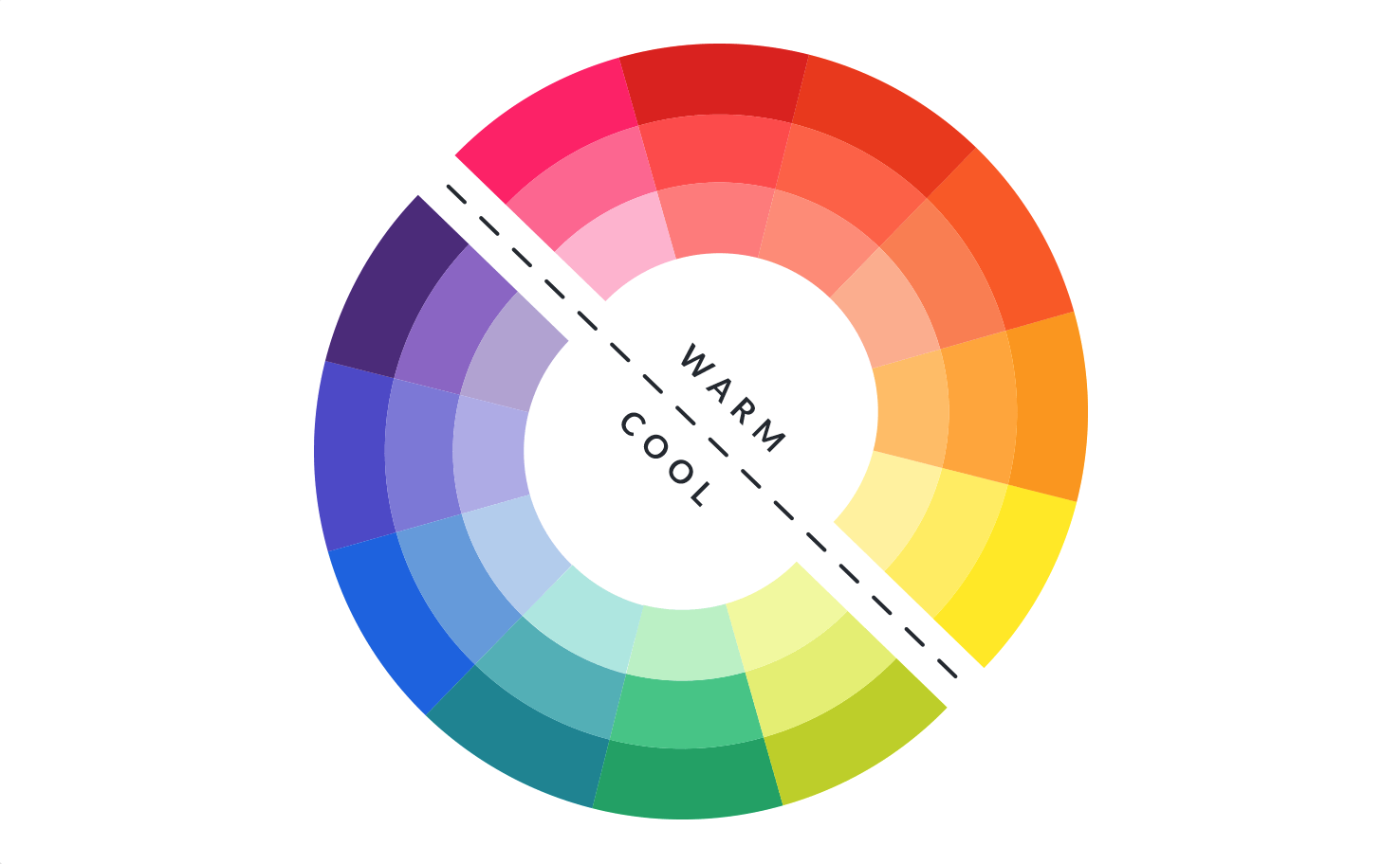
Warm vs Cold colours
Warm colours, such as reds, oranges, and yellows, are often associated with feelings of energy, coziness, and warmth.These tones can create inviting, dynamic spaces, making them great for areas where you want to encourage socializing or warmth, like living rooms or dining areas. Cool colours, like blues, greens, and purples, evoke a sense of calm, relaxation, and spaciousness.These colours are perfect for creating serene, peaceful environments, such as bedrooms or bathrooms, where you want to unwind and feel at ease. By thoughtfully mixing warm and cool colours, you can set the mood and function of any room in your home. |
Combining warm and cool colours allows you to tailor the atmosphere of your space, creating a balanced environment that reflects your desired mood. By thoughtfully blending these hues, you can energize certain areas while promoting calmness in others, helping to craft a space that feels dynamic yet harmonious. |

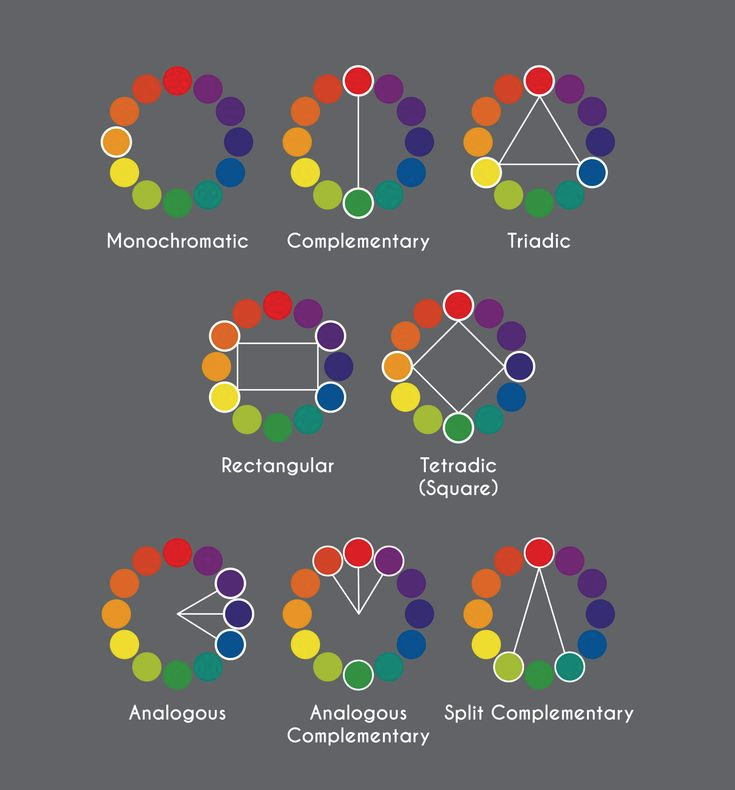
Complementary Colour Scheme
High Contrast & Bold Impact
Definition: Uses two colours that are opposite each other on the colour wheel (e.g., blue and orange, red and green, yellow and purple).
Effect: High contrast, energetic, and visually striking.
Best for: Statement pieces, modern or eclectic interiors, and bold, dynamic spaces.
This works well when one colour is dominant while the other serves as an accent (e.g., a neutral room with bold pops of complementary hues).
Think along these lines:
- A navy blue sofa paired with burnt orange throw pillows or an accent chair creates a striking and modern contrast.
- A rich wood or charcoal dining table with vibrant red or striking white chairs creates a dramatic, modern statement that’s both sleek and attention-grabbing.

Analogous Colour Scheme
Cohesive & Relaxing Aesthetic
Definition: Uses colours that sit next to each other on the colour wheel (e.g., blue, teal, and green; red, orange, and yellow).
Effect: Creates a smooth, natural flow with a calming effect.
Best for: Serene, cohesive interiors such as bedrooms, lounges, or spa-like environments.
Analogous colour schemes often use a mix of materials (e.g., wood, textiles, and metal) to add depth without overwhelming the space.
Think along these lines:
- A soft blue sofa, teal area rug, and green plants can create a cool, refreshing, and nature-inspired living space.
- Earthy tones like beige, terracotta, and warm brown can enhance a cozy and inviting bohemian or rustic setting.

Triadic Colour Scheme
Balanced & Playful Look
Definition: Uses three colours that are evenly spaced on the colour wheel (e.g., red, yellow, and blue or purple, green, and orange).
Effect: Vibrant, dynamic, yet balanced.
Best for: Playful, artistic, or eclectic interiors, as well as mid-century modern styles.
To prevent the space from looking overwhelming, use one dominant colour, with the other two as accents in textiles, artwork, or accessories.
Think along these lines:
- A mustard yellow chair, a navy blue sofa, and a burgundy coffee table can create a visually interesting yet balanced living room.
- Works well in children’s rooms, creative spaces, or retro-inspired interiors where a mix of bold hues adds energy and personality.

Monochromatic Colour Scheme
Elegant & Timeless Design
Definition: Uses different shades, tints, and tones of a single colour (e.g., various shades of grey, beige, or blue).
Effect: Sophisticated, minimalist, and calming.
Best for: Modern, Scandinavian, or high-end luxury interiors.
Different materials and textures (e.g., velvet, leather, wood, and metal) prevent a monochromatic space from feeling flat.
Think along these lines:
- A charcoal grey sofa, light grey armchairs, and a black coffee table create a sleek, modern space with depth and texture.
- A beige bed frame, tan bedding, and soft cream rugs result in a cozy, neutral-toned bedroom with warmth.
|
|
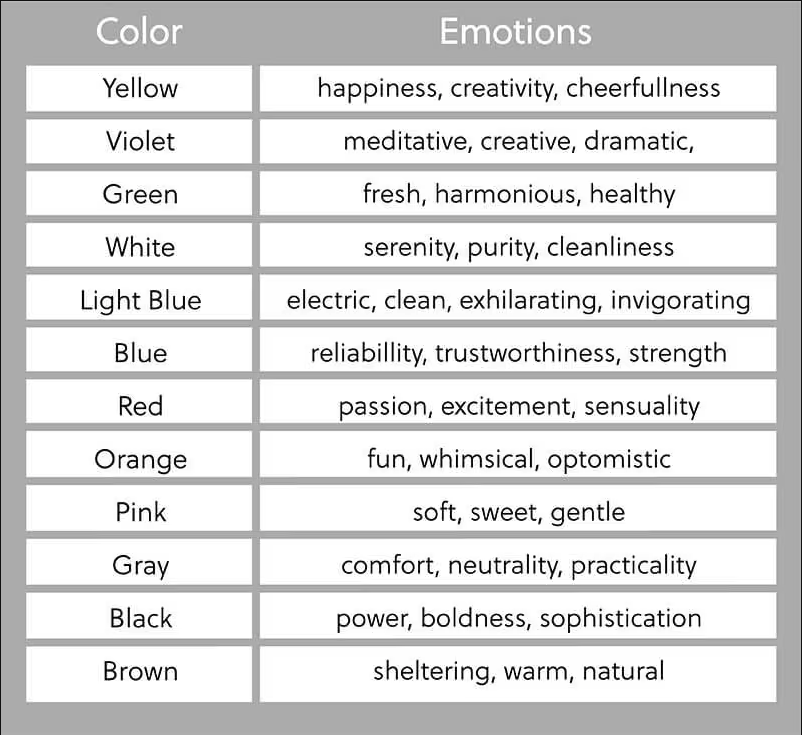
Colours have the power to evoke specific emotions and set the tone of a space.Understanding how different hues impact mood can help create an environment that reflects your style and enhances the desired atmosphere. For example, warm tones like red and orange can inspire energy and warmth, while cool shades like blue and green promote calmness and relaxation. Neutral colours, such as beige and gray, offer balance and sophistication. By selecting colours that align with your intended emotional vibe, you can transform your furniture choices into a harmonious, inviting setting. |